Stairs - Week 2
Issey Miyake - Stair Inspiration
1.
I am responding to the words linear, soothing and strength.


The steps within Brion Cemetery was not apart of the pdf document prescribed, however, some other work by Carlo Scarper was. I believe this very linear, 'blocky', geometric style is congruent with the aesthetics of Issey Miyake's designs.


Some further inspiration from Brion Cemetery that fuelled the creation of one set of stairs.
2.


Quite a simple design, though I hope to implement a similar feature in my step. Particularly of only having one side of the step in contact with a wall, leaving the other side floating free.
Louise Bourgeois
1.
The words precarious, danger and ascending I believe summate Bourgeois work.


The suspended wires give a slight sense of danger and discomfort, feeling at are quite synonymous with Bourgeois artwork.


This example may more strongly represent Miyake's work. However, there is one element I want to take from this stair. The short width gives the stair greater emphasis on the vertical, and the also gives a greater sense precariousness when climbing the stairs. As you are situated closer to void of space.
SketchUp Translation
Miyake's translation thus far.

The rational behind this design is for the communication of the 'fluid linear' that is strewn across Miyake's designs. The stairs should resemble a geometric style that would feed into his artistic direction. The glass is also a forethought of the need for Miyake to be able to view the world around him.
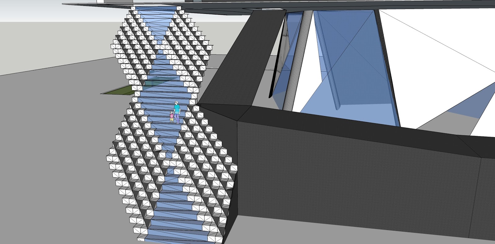
Bourgeois' steps in current form.

The main idea behind the stair representation of Bourgeois in precariousness. Her work 'The Spider" is one that makes the viewer feel unsettle, in doubt even, of the safety. Her work challenges society. The stairs mimic the challenge feeling of uncomfortableness her works try to convey. The stair is designed to be slightly difficult to traverse, pushing people in a diagonal ascent and descent. Furthermore glass steps in the centre of the stairs was designed to give people a sense of 'precariousness' on walking on "uncertain footing".
Update
As my skills have progressed the result was different stairs from the original.


I realised it would be necessary for there to be a ramp in conjunction with the stairs, as Bourgeois may need the ramp to carry large installation works into her gallery.


Miyake's stairs were in need to convey more strongly the geometric/linear/pattern nature. I thought suspending the steps with 'steel wire' would add in that aesthetic.


